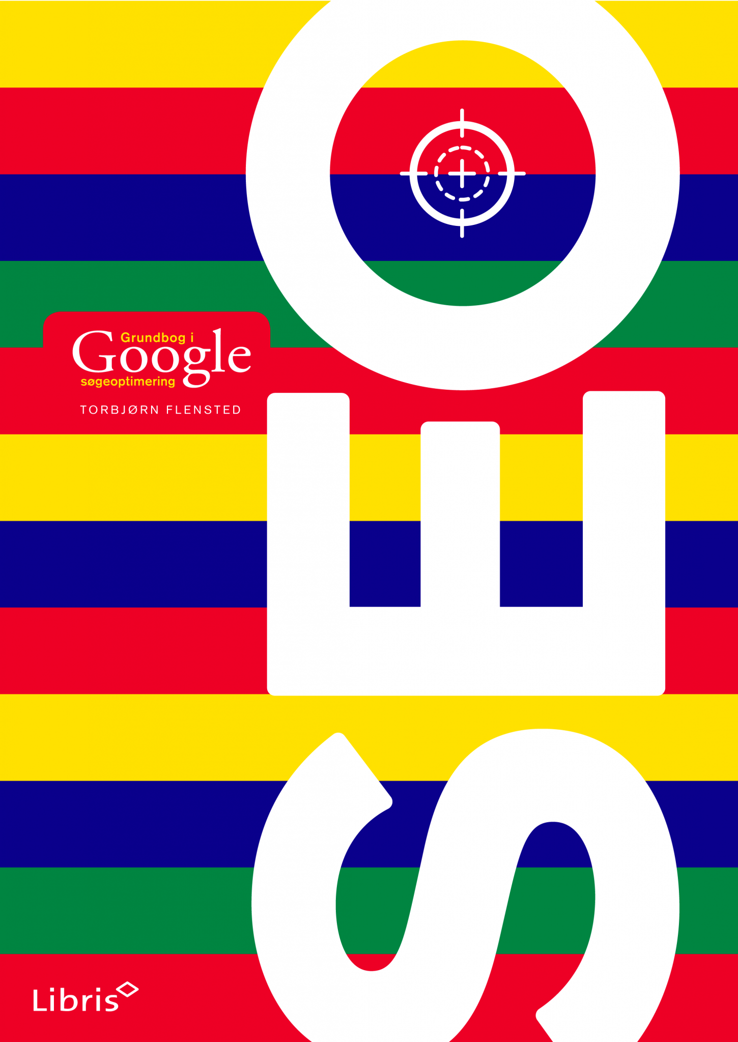
“Colours and stripes” would run over covers and spines, web site, apps and spin-off projects, signalling range and playfulness wherever needed.
Design concept
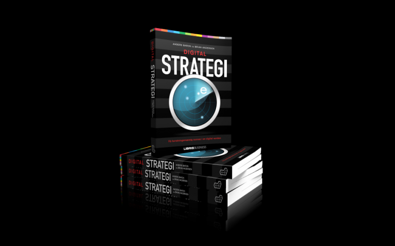
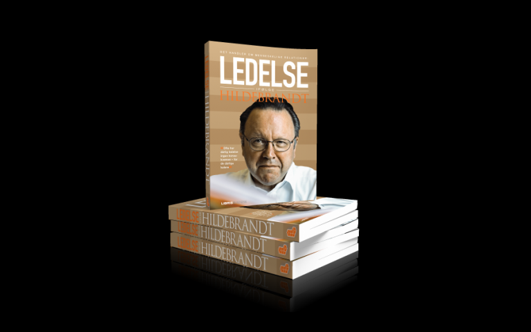
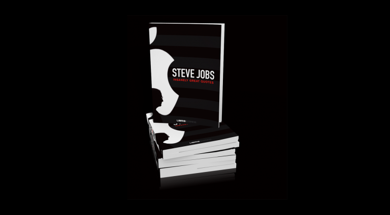
For business titles we would downplay the concept to toned lines in the background accentuated with partial varnish.
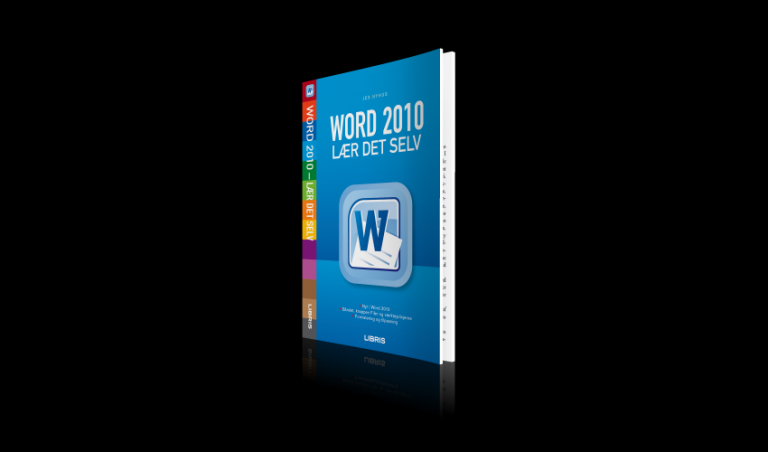
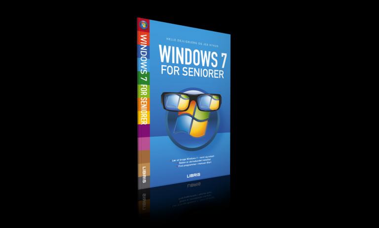
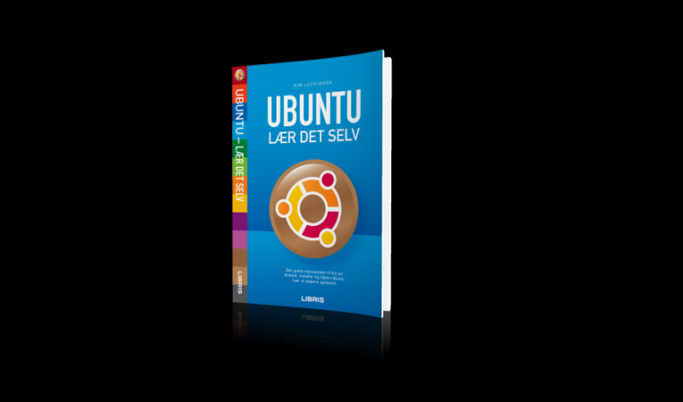
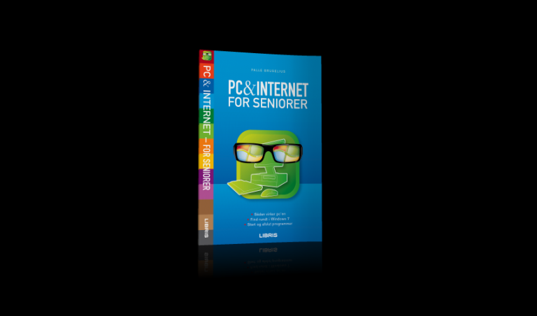
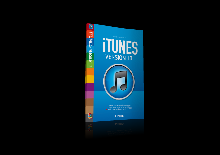
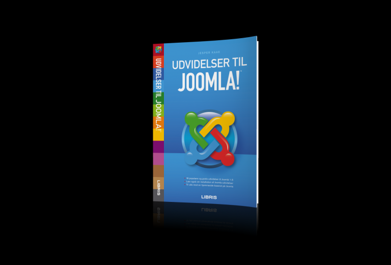
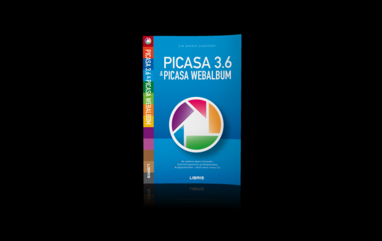
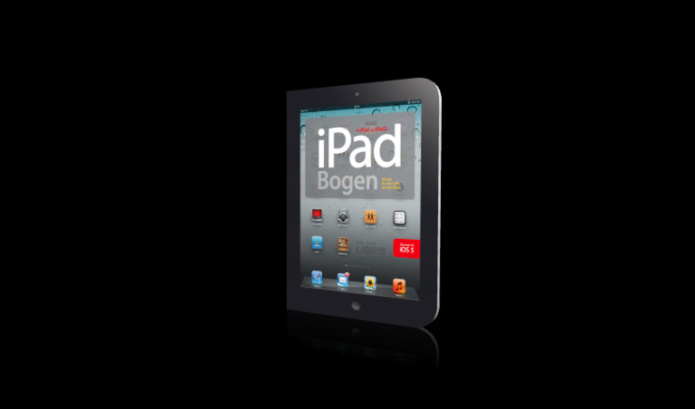
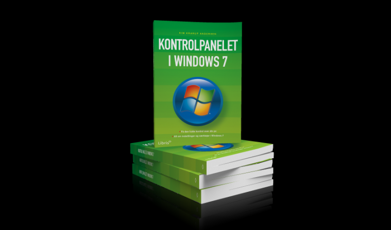
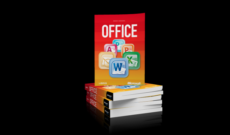
For the software manuals, we replaced animal images on recycles stock with the appropriate software icon set in a 2D backdrop. These would communicate intuitively and work across platforms.