Stephanie Ludlum from FIne Print approached me for an expression of excellence for her company branding.
A driving factor for Fine Print Consulting is to help clients communicate and strategize better.
And underlying principle for the brand is based on a Proverb: “Like apples of gold in silver carvings is a word spoken at the right time.”
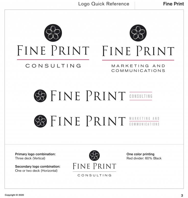
The icon is inspired by this: An apple blossom carved with a calligraphic line.
For the logotype, we gradually approached how to underline her authority in the field of communication.
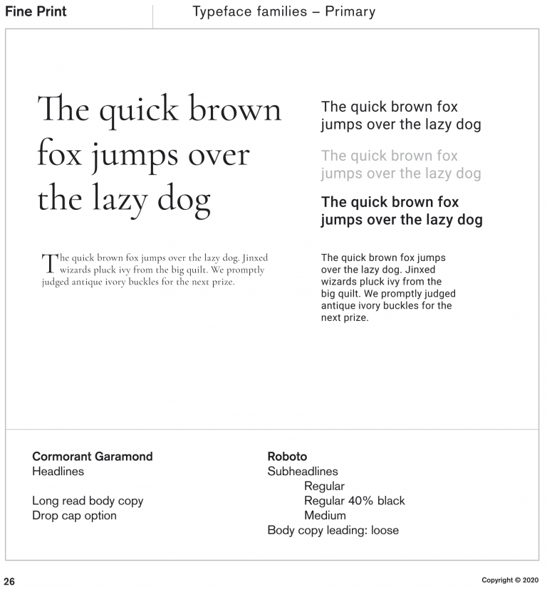
Combining a customized Trajan, a font that is derived from Roman Inscriptions with a solid, broad contrast typography in Akzidenz Extended gave breadth and weight needed.
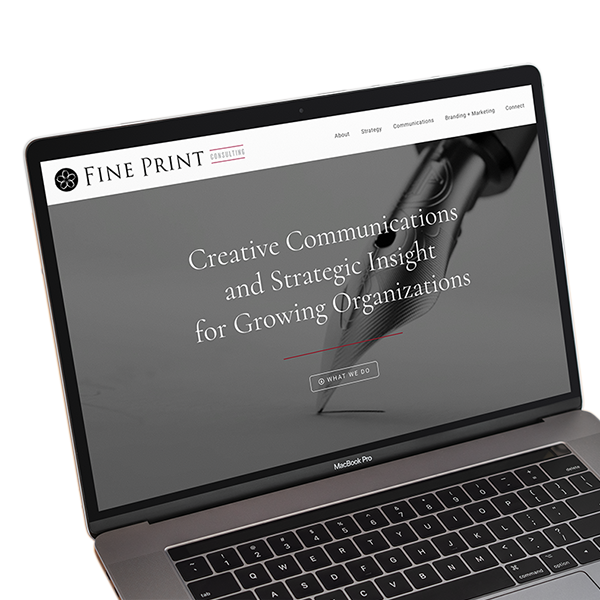
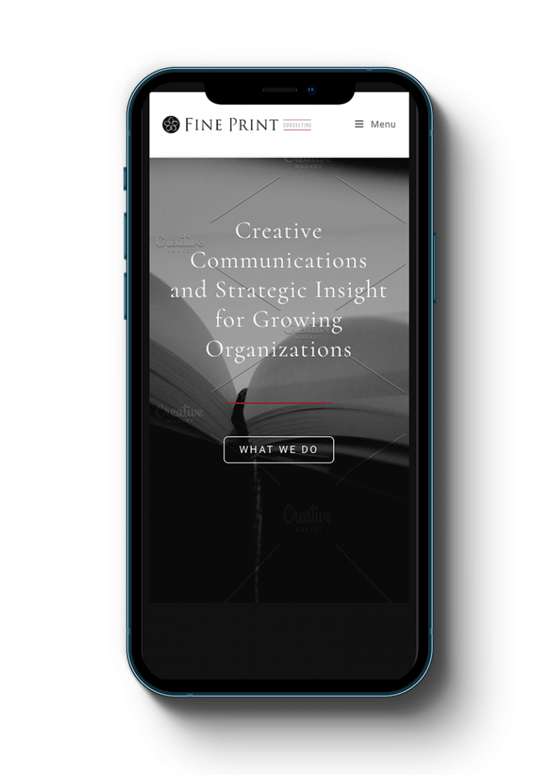
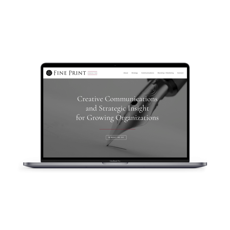
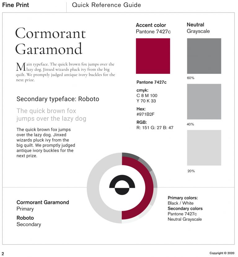
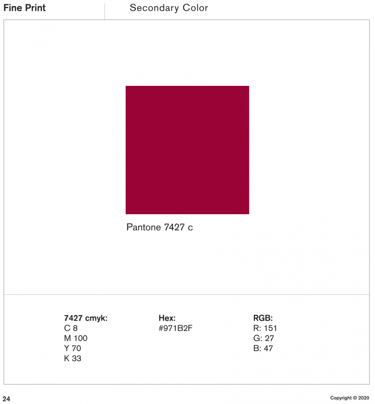
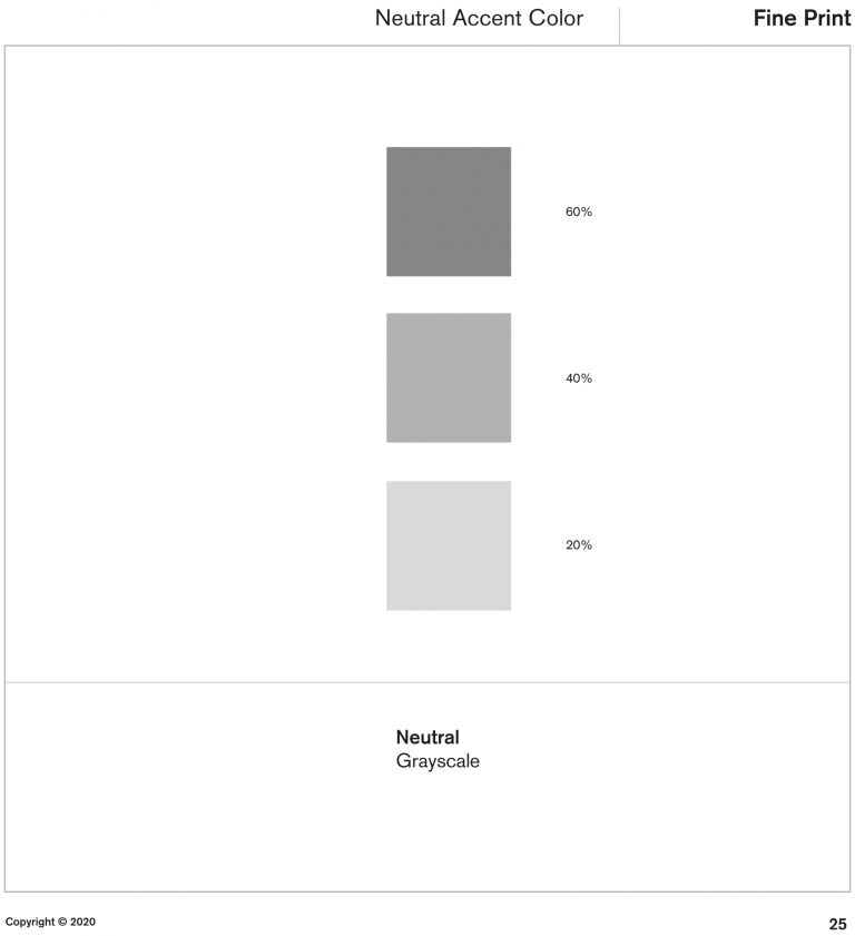
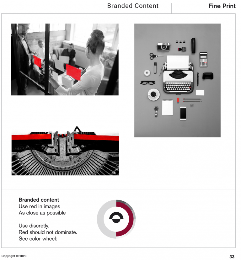
Colors and typeface families were defined to support the most important: The content.
Fine Prints forte is content. It was crucial, that the visuals did not compete, but was there as a framework, a space for the words to speak within.
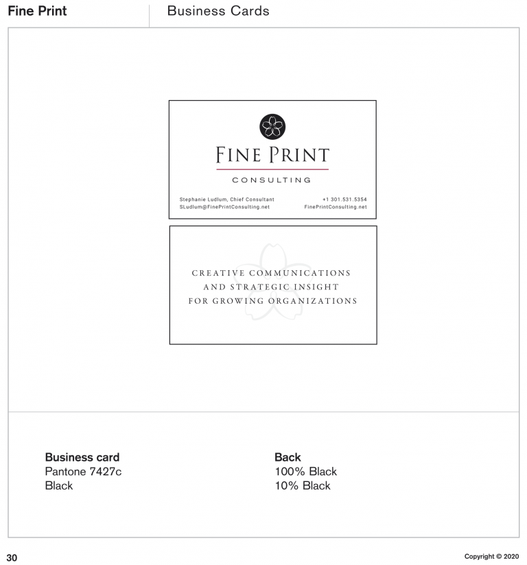
For the business card, the icon is varnished with a tactile, slightly raised varnish on a heavy mat stock. The tactile experience is that of a classic, tailored business card. One have to have a second look, just to see how the light reflects in the brand mark.
For the back, the brand mark appear in a discrete tone behind the brand slogan: “Creative communication and stretegic insights for growing organizations”.
The digital experience followed the brand guidelines to a consistent result. See the live site here:
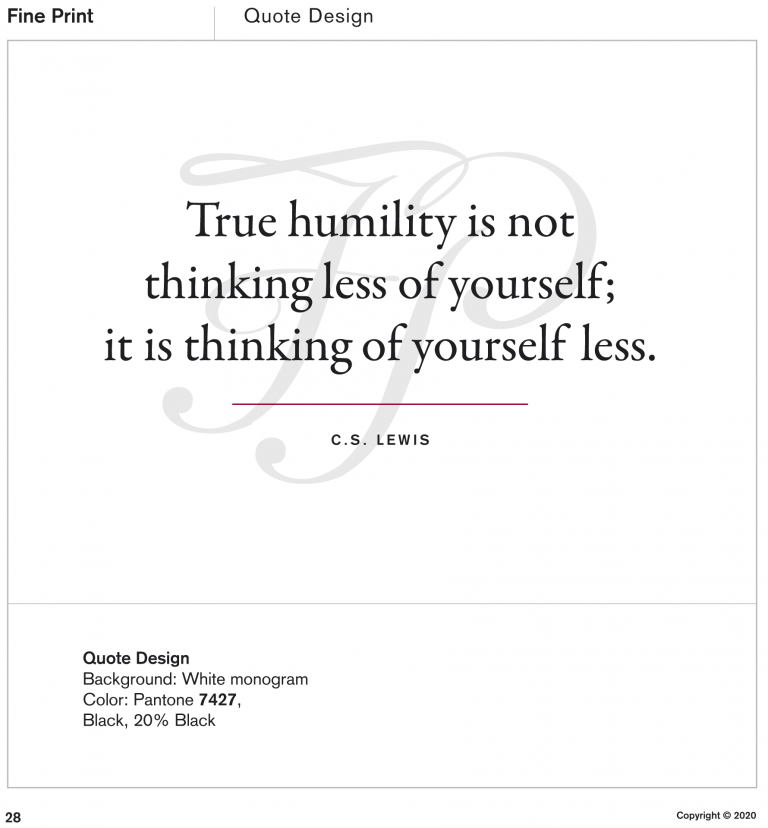
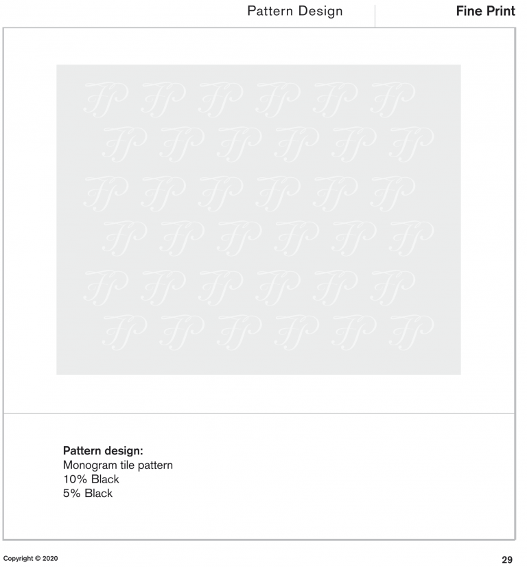
The little extra is often what makes the smile in the mind. In Fine Prints case, the calligraphic monogram and the brand mark emboss tool did theirs to add finesse to printed material and background patterns respectively.
The Fine Print Brand guide will help the company keep communication material synced with the Brand look at feel and tone of voice. Future team mates and freelancers won’t have to guess (or ask).