Distribution Independent
Magazine redesign for Fare Forward.
Reducing format size slightly and limiting colours from 4 to 2, brought printing costs down with around 30%, without losing significant design identity. Rather, the limitation became a brand marker for the publication.
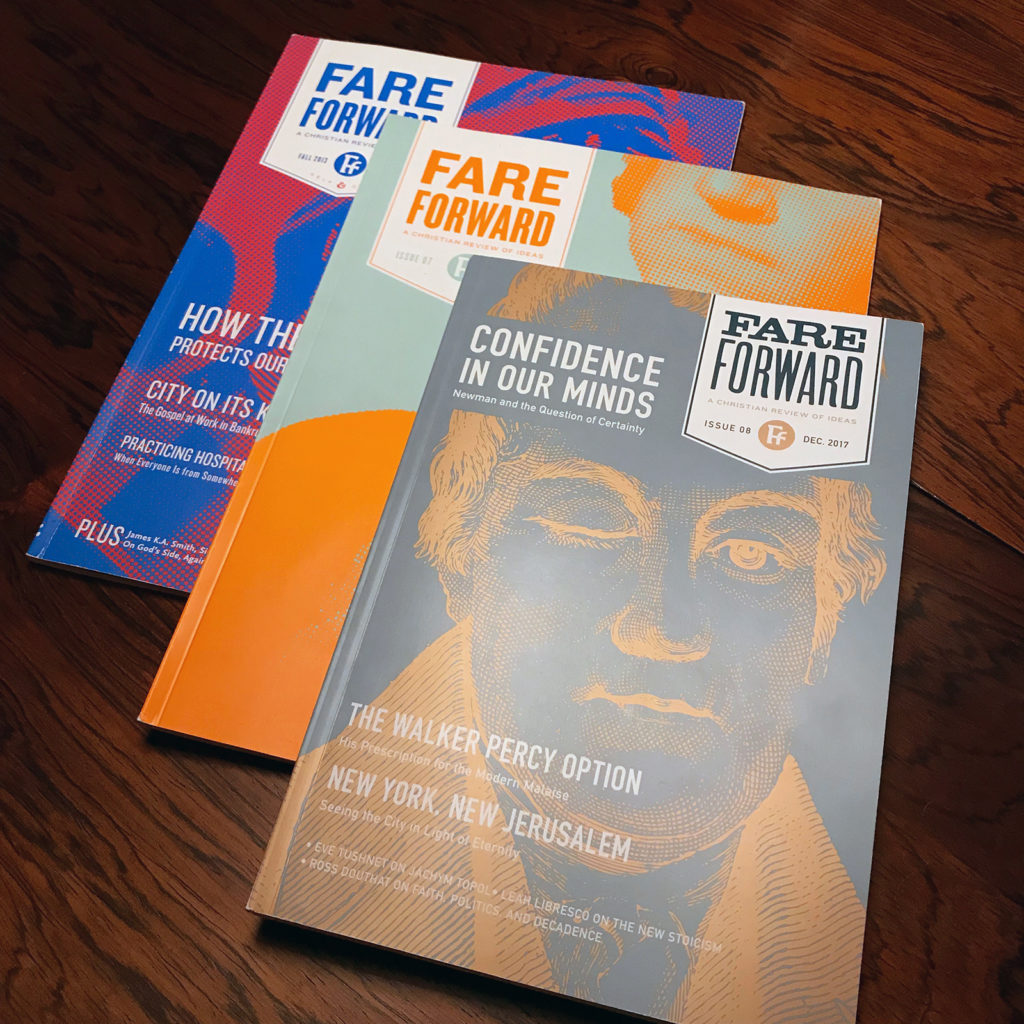
Passion for the written word and editorial wit is hard to come by, but the editorial team behind Fare Forward don’t lag any.
Design Details
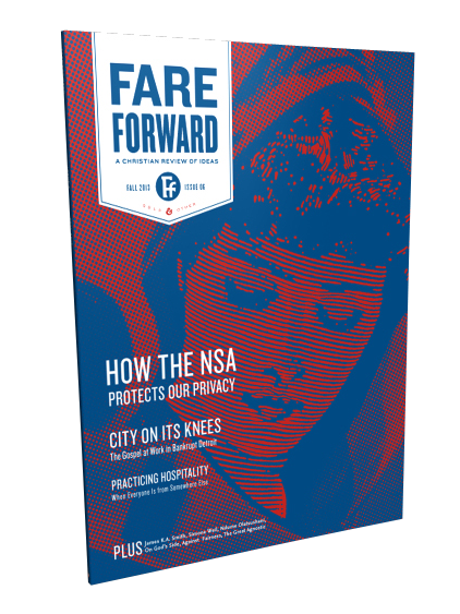
Combine Victorian clip-art, ink illustration, b/w photo, heavy rasterisation and 2-color combos.
Typography and layout kept functional and simple, with expression liberty in headlines.
Print costs was reduced by reducing the format slightly to maximise the printing plates. We replaced full color for 2-color on cover and interior.
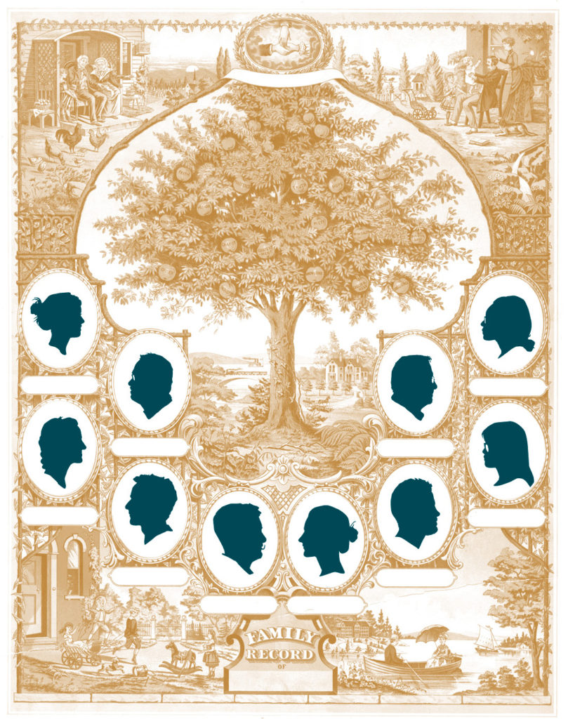
Victorian clip-art plus crisp profile illustration.
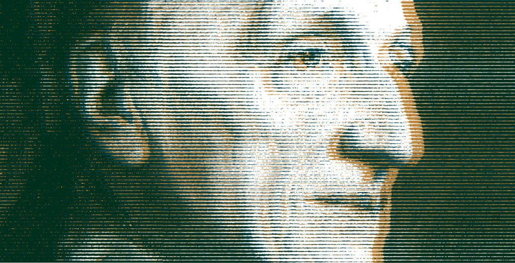
Two-color printing: Bottle green and Copper metallic.
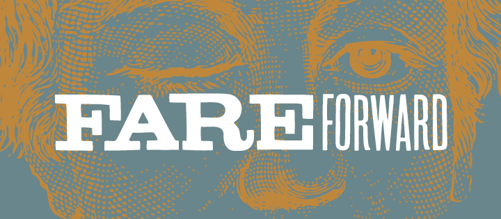
Social media banner design.
Brand mark. 2020.
Not to be confused with the “friheden” logo designed a year later by the friendly Tobias Røder.

Logotype in old-school wood block letters.
